Skip to content

TRASSIR Learn

I worked on redesigning this learning platform while at DSSL / TRASSIR. Here I revisit that real project with my current approach: start with the specialist’s task, then connect a useful technical answer to a structured learning path.

Project
Work project · revisited for the portfolio
Product
Technical learning platform and landing page
Revisited
2026
Role
Product Designer
Platform
Responsive web · English and Russian
Version shown
Current reinterpretation · interactive prototype

Outcome. A technical answer can be read before sign-in and reused inside a learning programme. Reading, completed units and assessment results remain separate facts. What it cost: explicit completion, staged access and a smaller qualification promise than a conventional training portal makes.

Current rework
Product framing, research synthesis, IA, UX/UI, design system and prototype
Research for this version
Secondary research, competitor audits and simulated interviews
Prototype checks
Agent-led browser checks; no human usability study of this version
TRASSIR Learn home with task-based entry points, with a learning programme and a technical material behind it
One product, two ways in: find an answer or choose a programme. Screens use demonstration content.

The old entry point offered courses before it understood the task.

The archived product opens with a course catalogue: search, topic and brand filters, ratings and rewards. Another original screen asks for company details before unlocking courses. These screens show the starting structure; they do not tell us how well real users completed their work.

For the redesign, the useful distinction was between two situations. An engineer investigating a camera that cannot be discovered needs a sequence of checks. A designer asked to learn the product range needs a route, an estimate of the work and a clear finishing condition. Sending both into the same course list leaves them to reconstruct that route themselves.

Original platform. The course-led entry point from the archive. The Russian screenshot is preserved unchanged; it is not a record of the redesign delivered during my employment.
My approach today. Start with the work to be done, then choose an answer or a structured programme. This is the current portfolio version.

A useful answer became the smallest unit of the learning system.

The central hypothesis was that reference and learning could share content without sharing every rule. A material has its own address, product version and update date. It can answer one question independently and occupy a named place inside a programme. The reader should not have to enrol simply to discover whether it is relevant.

That also changes the meaning of progress. Opening a troubleshooting article is evidence of reading, not evidence that its learning objective has been completed. The two records need to meet in one personal space while remaining independent. Otherwise an innocent page view starts making qualification claims.

Give the answer its own address. Let a programme organise those answers without turning every visit into a completed lesson.

I made both routes testable before treating the screens as finished.

For this rework, I returned to the original screens and the problem I had worked on in the company. I added secondary research and competitor walkthroughs. The personas and interviews used in this new iteration were synthetic: useful for challenging assumptions, insufficient for claiming demand. They informed two equally important acceptance routes — an engineer finding a technical answer and a designer starting and completing structured training.

The PRD then fixed the access ladder, content model and counting rules before the sitemap, design system and interactive build. The public programme page exposes its purpose, workload, full contents and assessment conditions before sign-in. Both the service and its landing are available in English and Russian; links from this portfolio open the selected language.
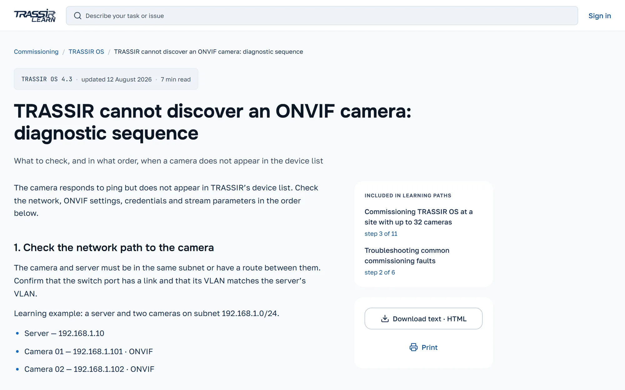
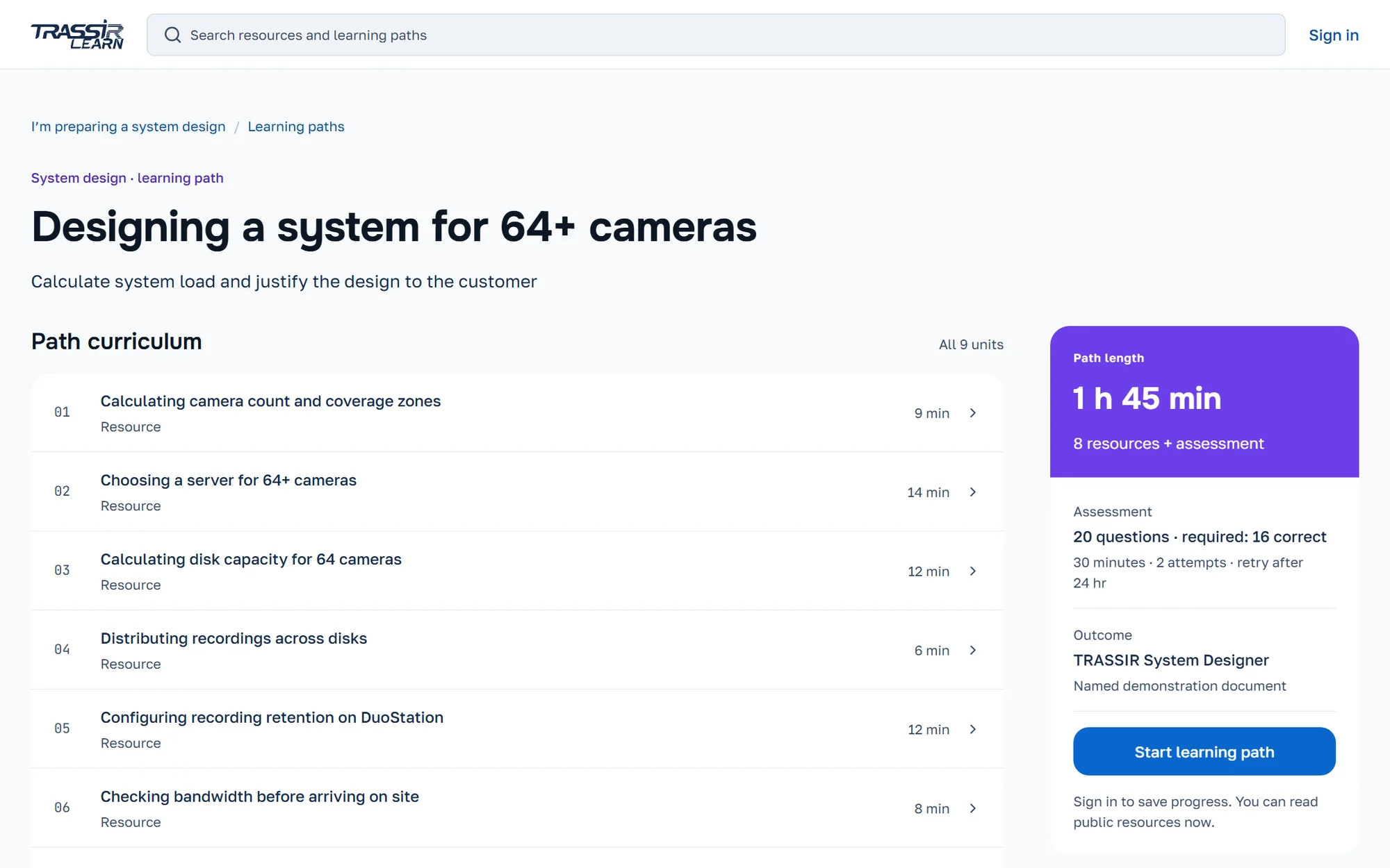
The current portfolio version, with local demo data. Open the landing separately from the case header.

Open the learning prototype (external link, opens in a new tab)
The commitment is inspectable before starting: outcome, workload, contents and assessment conditions.

A completed screen still hid its most important action.

The final browser acceptance found a primary button whose label inherited a muted text colour. The action existed and the screen was assembled, but the next step was difficult to read. The fix belonged in the shared text rule, followed by checks of sign-in, explicit completion and next-unit navigation at three widths.

This new version still needs subject-matter review of its question bank. Some questions rely on sources outside the selected programme. Those sources are disclosed before assessment, but disclosure cannot establish that the assessment measures competence. The prototype demonstrates my current design approach; it does not establish learning outcomes for either this version or the original work project.

Four decisions keep useful access separate from earned completion.

Open reading comes first; sign-in is requested when it can preserve something.

Why
A person arriving with an ONVIF problem needs the checks, product version and source immediately. An account adds history and continuation. Company verification is a later, separate condition for partner materials and assessment.
Cost
Three access levels need clear explanations and exact return paths. A failed code or a rejected company check must return to the original material or programme after correction.
The technical answer is visible before sign-in. Its version is part of the answer, not a trust badge.

Reading history and completed programme units are counted separately.

Why
Reading can happen through search, a programme or a repeated visit. Completion requires an explicit action in that programme. Refreshing a page does not finish a unit, and progress in a second programme does not rewrite the first.
Cost
The user makes one more deliberate action. The system carries two records and explains their difference instead of compressing them into an attractive but ambiguous percentage.

Practice explains an error; assessment records an attempt.

Why
Practice preserves the selected answer, explains the mistake and links to its source. Retrying or skipping does not increase assessment eligibility. The assessment changes to a neutral, focused visual mode with explicit rules and a threshold.
Cost
Practice and assessment cannot be cosmetic variants of one quiz. They need different behaviour, feedback and persistence, and the interface has to make that boundary visible.
A mistake stays visible long enough to be understood. Practice does not silently fill the completion record.

A connection failure must not create a new assessment attempt.

Why
Once submitted, answers remain fixed under the same attempt ID. After a network error, retry uses that attempt and produces one result and one demonstration document. Refresh, browser navigation and later sign-in must preserve their identity.
Cost
Recovery requires more than a retry button: saved answers, an explicit interrupted state and a result that can be reopened. The demo keeps these within the browser tab; it does not provide cross-device synchronisation.
One attempt, one result, an explicit threshold. The document records a demo outcome, not an official qualification.

Colour identifies the work; it never rewards the score.

Four content colours carry the task from home into the catalogue, material and player. Status colours have a separate meaning. Assessment deliberately switches to neutral, while version and update information stays neutral everywhere. There are no points, streaks or success celebrations substituting for progress.

The landing shares that visual vocabulary but uses its own type scale, spacing and component set. It proves the promise with a material and a programme rather than invented testimonials. Its first useful action opens the product; English and Russian lead to the corresponding product language.

Personal learning space — reading history · programme continuation · separate completion records
Public landing — programme preview · open material · explained access levels

The prototype can demonstrate the promise. Learning outcomes remain unmeasured.

Rebuilt
Both routes work in the current prototype: find and revisit a technical answer, or inspect a programme, resume it, practise and reach a recoverable assessment result.
Sacrificed
Automatic credit for reading, reward mechanics and an official certification claim. Each would imply more knowledge about the learner than this prototype can establish.
Checked
The documented 7 September acceptance covered 36 states at three widths: 108 combinations, with zero final automated axe violations. Browser scenarios included failed sign-in, company correction and retry after a real network interruption.
Next evidence
Test both routes with real specialists, validate the content and question bank with an expert, then measure answer-finding and programme continuation against a baseline.

These engineering checks apply to the current portfolio version. They do not describe testing or measured results from the original work project. This version has not been released as the company’s product. Screen-reader and physical-device testing remain open; storage lasts within the browser tab, messages and company checks are simulated, and a full offline application is not implemented.

The interesting question is where an answer becomes learning.

That boundary shaped the content, access, progress model and recovery behaviour throughout the product.

Next case: Vet Clinic OS

Let's talk

If the case above answered your question — or raised one.