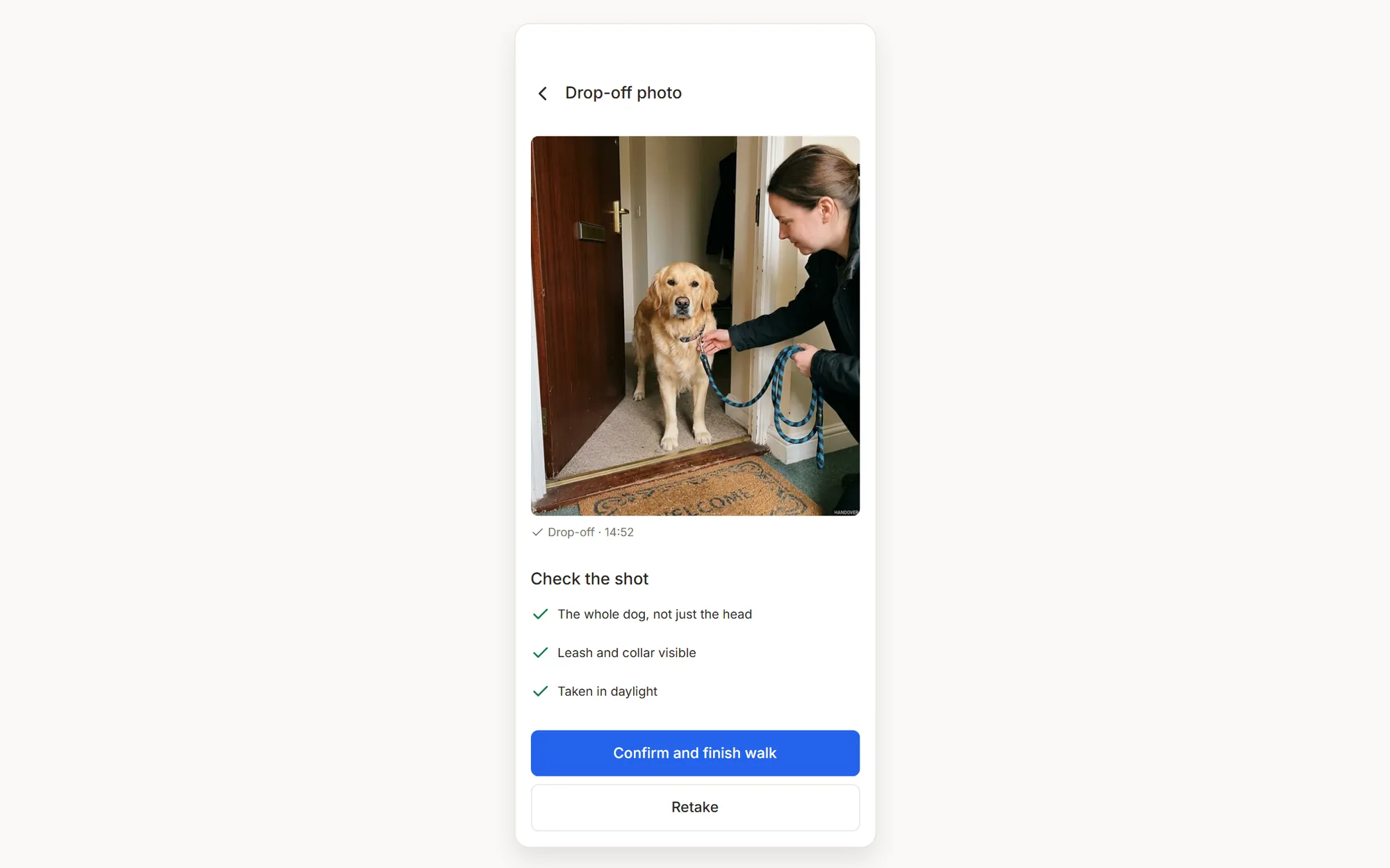
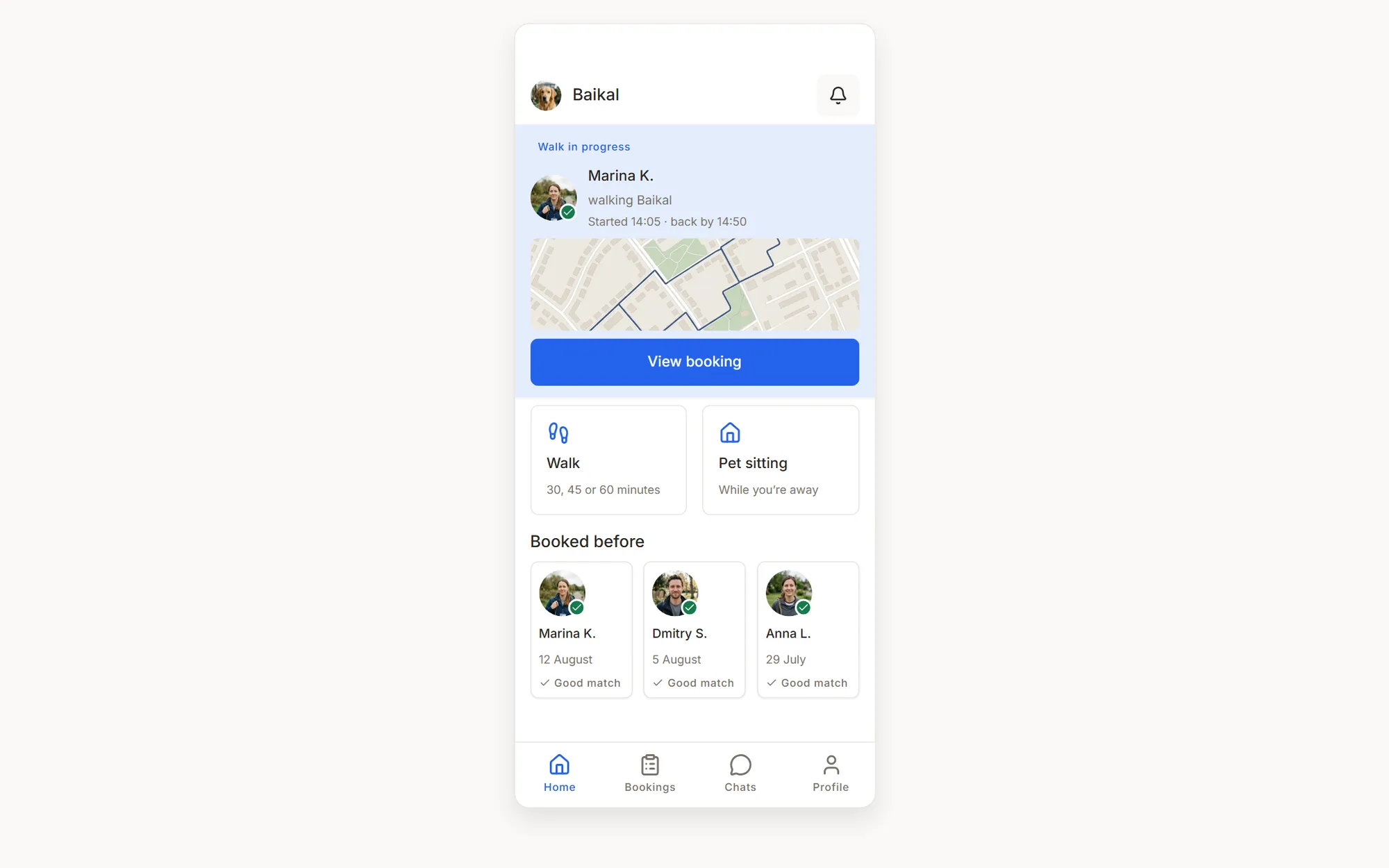
I started with secondary research, five competitors and a focused audit of the closest analogue. The primary-persona interview was simulated, not recruited, and used only to challenge the first hypothesis. It did: the final pickup and drop-off photos mattered more than watching the whole route, and “pet is home” mattered more than a perfect GPS line. Those remain hypotheses for live interviews, but they were strong enough to change what the prototype had to make testable.
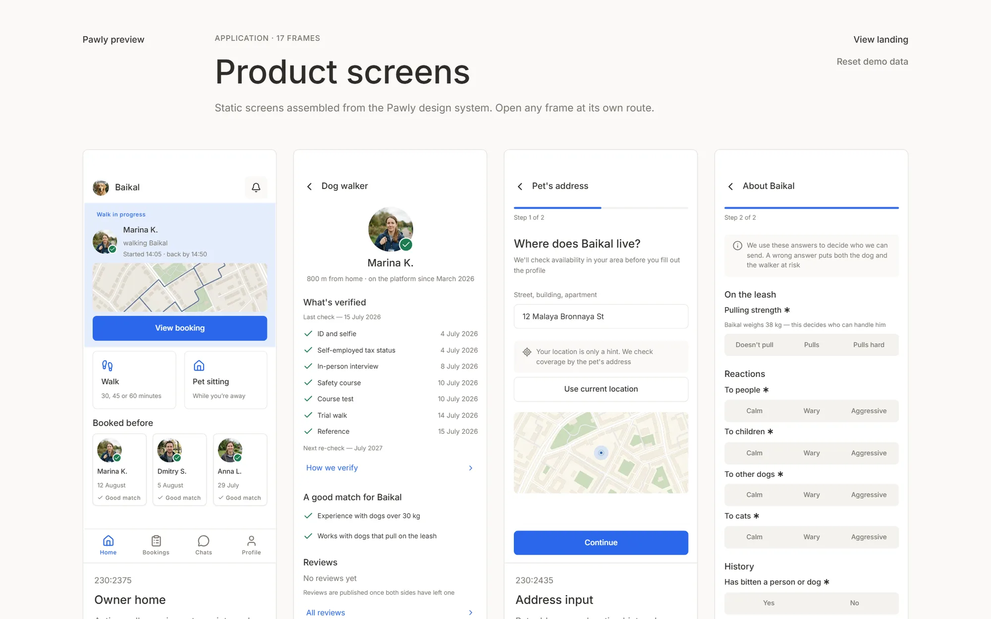
Scope came next: 42 Must-haves out of 65 requirements, then a 95-screen product map with 81 core nodes and seven user flows. I deliberately did not turn every node into a frame. Eighty-one were designed at flow and group level; sixteen decision-heavy screens were assembled into seventeen routed frames, plus the landing. That kept the built layer on the questions worth testing — compatibility, verification, handover proof, replacement and two-sided money — instead of spending the same time on routine settings screens.
Then the visual system and the build: 63 primitive tokens, 30 semantic tokens, fourteen text styles and 33 React components with named Storybook matrices. Figma, specifications, React and the catalogue use the same semantic names. The prototype went through structural review, parity review, visual acceptance and synthetic agent runs; the findings returned to the same source instead of being patched only in screenshots.